Based on first impressions:
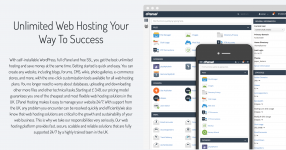
1. I appreciate text-based logos, but yours immediately appear too small in relation to the rest of the website. I'd increase the size.
2. The navigation text menu items feel a little too condensed. Create a bit more spacing between letters so that it's easier for the eyes to scan.
3. I don't mind the neatly prepped bullet points in the header, but this part offers way too much text. No one wants to read this much. If you want, pick up to 5 key points and offer them as bullet points next to the cPanel screenshot.
Also, update the cPanel screenshot above with the new theme that cPanel is rolling out. Stay one step ahead.

4. The part with the hosting packages, I feel, needs to come right below the header. You can place the part described in point 3 above below the plan offers.
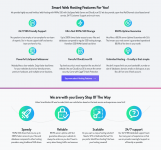
5. The below two sections have some repeated information, like about speed and reliability/uptime. I'd try to find a way to merge the two sections into one. It will help declutter the mid page and make it feel light.

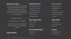
6. I understand you are trying to think about SEO in trying to add another description into the footer, but perhaps you can simplify it so that it doesn't come across so heavy on words again. "So regardless of your needs and the size of your business, we have your hosting covered!" sounds like something was written in a hurry.
Also, information about the actual payment methods is missing.

This is just the feedback about the home page. I didn't look through other pages.
