Feedback please SmartHoster.uk website

huncky

New member
We have just launched our new SmartHoster.uk website and are looking forward to community feedback.
Do you have any constructive ideas? Good and bad comments are appreciated!
 
Based on first impressions:

1. I appreciate text-based logos, but yours immediately appear too small in relation to the rest of the website. I'd increase the size.

2. The navigation text menu items feel a little too condensed. Create a bit more spacing between letters so that it's easier for the eyes to scan.

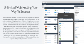
3. I don't mind the neatly prepped bullet points in the header, but this part offers way too much text. No one wants to read this much. If you want, pick up to 5 key points and offer them as bullet points next to the cPanel screenshot.

Also, update the cPanel screenshot above with the new theme that cPanel is rolling out. Stay one step ahead.

Screen Shot 2021-06-20 at 11.19.14 AM.png

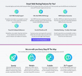
4. The part with the hosting packages, I feel, needs to come right below the header. You can place the part described in point 3 above below the plan offers.

5. The below two sections have some repeated information, like about speed and reliability/uptime. I'd try to find a way to merge the two sections into one. It will help declutter the mid page and make it feel light.

Screen Shot 2021-06-20 at 11.25.34 AM.png

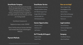
6. I understand you are trying to think about SEO in trying to add another description into the footer, but perhaps you can simplify it so that it doesn't come across so heavy on words again. "So regardless of your needs and the size of your business, we have your hosting covered!" sounds like something was written in a hurry.

Also, information about the actual payment methods is missing.

Screen Shot 2021-06-20 at 11.29.03 AM.png


This is just the feedback about the home page. I didn't look through other pages.
 
Since I do SEO all day, I'll say this about the footer;
the footer is on every page, and as a result, it carries very little weight when it comes to SEO value. It does help ensure that Google and Bing can find the important pages, but your top navigation should be doing that anyway.

Having an entire screen filled with the footer is going to annoy most users (if they even make it to the footer). The goal is that a user never actually reaches the bottom of your page, and really at that point, they should only have the most important items to see.

If you want to keep all the links, what I'd recommend is to reduce the font size in the footer.

As a client, I'll need to be able to log in and pay the bill etc. While the "My Account" is in the footer, maybe having a thin gray line above the top navigation and adding a "Client Login" option in there. This way it's not taking the focus of the navigation (which is sales), but is still easy to get to.

I'm not a fan of waiting on pages to load, and spinning animations personally annoy me (but I'm just one guy) :) That said, there's something wrong with the "Unlimited Web Hosting" page having to take as long as it does to load up. (I'm located in Omaha, Nebraska, USA - dead center of the US), but the load time was 1.8 seconds for the page. There's nothing overly fancy on the page, and the total size is only 450kb, so maybe it's just the connection between my location and your data center. Maybe throw it out through Cloudflare?

A clean site overall. Just needs some adjustments with the footer, and then some extra content so that each of the pages don't appear the same
 
I just glanced over your site and only saw one thing that had not been mentioned and that is the copyright date is still sitting on 2020. I think the site looks great.
 
If you are a UK business with a UK support team then I don't see the reason for this image on your home page


especially when a google search shows this to be a rented house in Penang

I'd guess it's just a friendly looking house/view intended to convey the idea that the support is friendly, and 99.999 % of people aren't going to reverse image search to find out where the house is.

They might want to pick one that better represents the UK weather, but apart from that I don't see a big problem with it.

I think a bigger issue is that when I click on 'Chat now' at the 24/7/365 support part, it just takes me up to the top of the page instead of giving a me a person to talk to.
 
Top